Establishing a successful career can take many different forms and at times, it can be overwhelming to determine the right path to take. However, one thing is certain, the knowledge gained throughout this journey will always be valuable, contributing to new experiences.
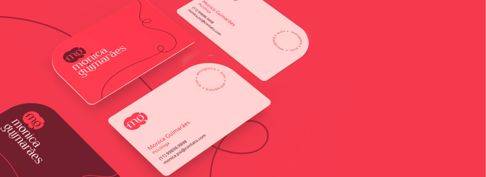
Considering this context, the idea of creating a modular brand emerged, one that can be applied in various ways without losing its essence.
Concepts
Letters created from a set of blocks.
Union


Use of simple yet striking geometric shapes.
Practicality
The brand is modular and can be applied in different ways without losing its essence.
Dynamism


In order to establish a stronger connection with the brand, the institutional font has been designed with rounder shapes and fewer details. The presence of circles provides a sense of lightness and clarity to the writing.
Franie


Pattern
The choice of geometric shapes was designed to facilitate the use of patterns.

Icons
In order to create a cohesive brand identity, the icons are derived from the geometric shapes used throughout.